Any fool can know. The point is to understand.
—Albert Einstein
Quick Start
Getting an Initial Schedule
To build a schedule, import a learning tracker and provide it with its initial conditions:
from datetime import datetime
from space.repitition import pp
from space.repitition import LearningTracker

lt = LearningTracker(epoch=datetime.new())
Then ask your learning tracker for its schedule:
days_after_epoch=43
print("Schedule as dates")
pp(lt.schedule(stop=days_after_epoch))
Something like this would appear in your terminal window:
Schedule as dates
[ datetime.datetime(2019, 1, 23, 17, 19, 47, 366483),
  datetime.datetime(2019, 1, 24, 3, 48, 2, 179641),
  datetime.datetime(2019, 1, 24, 14, 53, 13, 389181),
  datetime.datetime(2019, 1, 25, 3, 28, 0, 665353),
  datetime.datetime(2019, 1, 25, 18, 44, 34, 494393),
  datetime.datetime(2019, 1, 26, 14, 57, 57, 876099),
  datetime.datetime(2019, 1, 27, 21, 34, 13, 598825),
  datetime.datetime(2019, 1, 30, 9, 10, 8, 272185),
  datetime.datetime(2019, 2, 8, 9, 16, 1, 852609)]
Understanding where a Schedule Comes from
To see the graph from which this schedule was derived:
hdl, _ = lt.reference.plot_graph(stop=43)
lt.show()
hdl.close()  # save your computer-memory

The graph’s x-axis represents time while the y-axis represents the amount a student can remember about the thing they are trying to learn. The student has perfectly remembered an idea if its score is one and they have utterly forgotten an idea if its score is zero.
The red stickleback looking graph represents how a students recollection ability will rise and fall as a function of training events and the passage of time from a given training event. At first, a student forgets something quickly, but as they train on an idea, that idea will fade slower from their memory. The sudden vertical-rise of this red line represents a moment when the student studies. There is an assumption that they will review an idea long enough that their immediate recollection of that idea will be perfect before they stop thinking about it.
The blue line maps to plasticity, or how fast an idea can be mapped into a mind as a function over time. It can be thought of as representing how memories form over the long term.
The training events occur where the forgetting curves of the stickleback approach the plasticity line. At each intersection of the forgetting curve and the plasticity curve, orange lines are projected downward to the x-axis to provide the suggested times of study. Collectively, these times are called the schedule.
Adding Student Feedback
When the spaced algorithm is first turned on, its schedule is entirely
arbitrary: this is because the model doesn’t understand anything about the
student yet. But each time you give it student data it adapts its schedule to
the student’s behaviour, and how they appear to be forgetting things.
Imagine that immediately after looking at the material for the first time; our
student tries to remember what they just learned. They decide to test
themselves and determine that they can recall about 40 percent of the material
nine seconds after looking at it for the first time. To tell spaced about
this, we would write the following code:
days_since_training_epoch = 0.0001  # ~ 9 seconds
lt.learned(result=0.4, when=days_since_training_epoch)
After our student finished this self review, they would study their material until they could recall all of it.
Suppose that 19 hours later (0.8 days later), the student tests themselves again. This time they can remember 44 percent of what they wanted. Let’s feed this into the learning tracker, by writing the following code:
days_since_training_epoch = 0.8
lt.learned(result=0.44, when=days_since_training_epoch)
As before, after they finish this self examination, they would restudy their material until they could remember all of it.
Getting a Schedule which Responds to the Student’s Feedback
Now that spaced has more data, let’s ask it for a new schedule that spans
the time between the last feedback moment and up to 5 days after the training
began.
print("Schedule as dates")
pp(lt.schedule(stop=5))
In your terminal you will see something like this:
Schedule as dates
[ datetime.datetime(2019, 1, 25, 0, 47, 23, 383894),
  datetime.datetime(2019, 1, 25, 13, 14, 43, 265794)]
You could get the same schedule by providing a datetime object as the stop argument:
print("Scheduled as dates")
# get a schedule from epoch to five days from epoch
pp(lt.schedule(stop=datetime(2019, 1, 26))
Scheduled as dates
[ datetime.datetime(2019, 1, 23, 3, 13, 45, 753025),
  datetime.datetime(2019, 1, 23, 15, 41, 5, 635312),
  datetime.datetime(2019, 1, 24, 6, 39, 35, 613096),
  datetime.datetime(2019, 1, 25, 2, 28, 43, 835472)]
If you would have rather seen the schedule as a set of date-offsets from the
starting moment of training (its epoch) you could use the
schedule_as_offset api:
print("Schedule as offsets in days from the training epoch")
pp(lt.schedule_as_offset(stop=5))
Schedule as offsets in days from the training epoch
[ 1.2507216586504115,
  1.7374520166988208,
  2.3041058337185985,
  3.0183370061964974,
  4.022524650984104]
Understanding the Reactive Schedule
The spaced schedule changes as it reacts to feedback from the student. To
see why this change has occurred we can look at the plots from which this
schedule is derived:
hdl, _ = lt.plot_graphs(stop=10)
lt.show()
hdl.close()

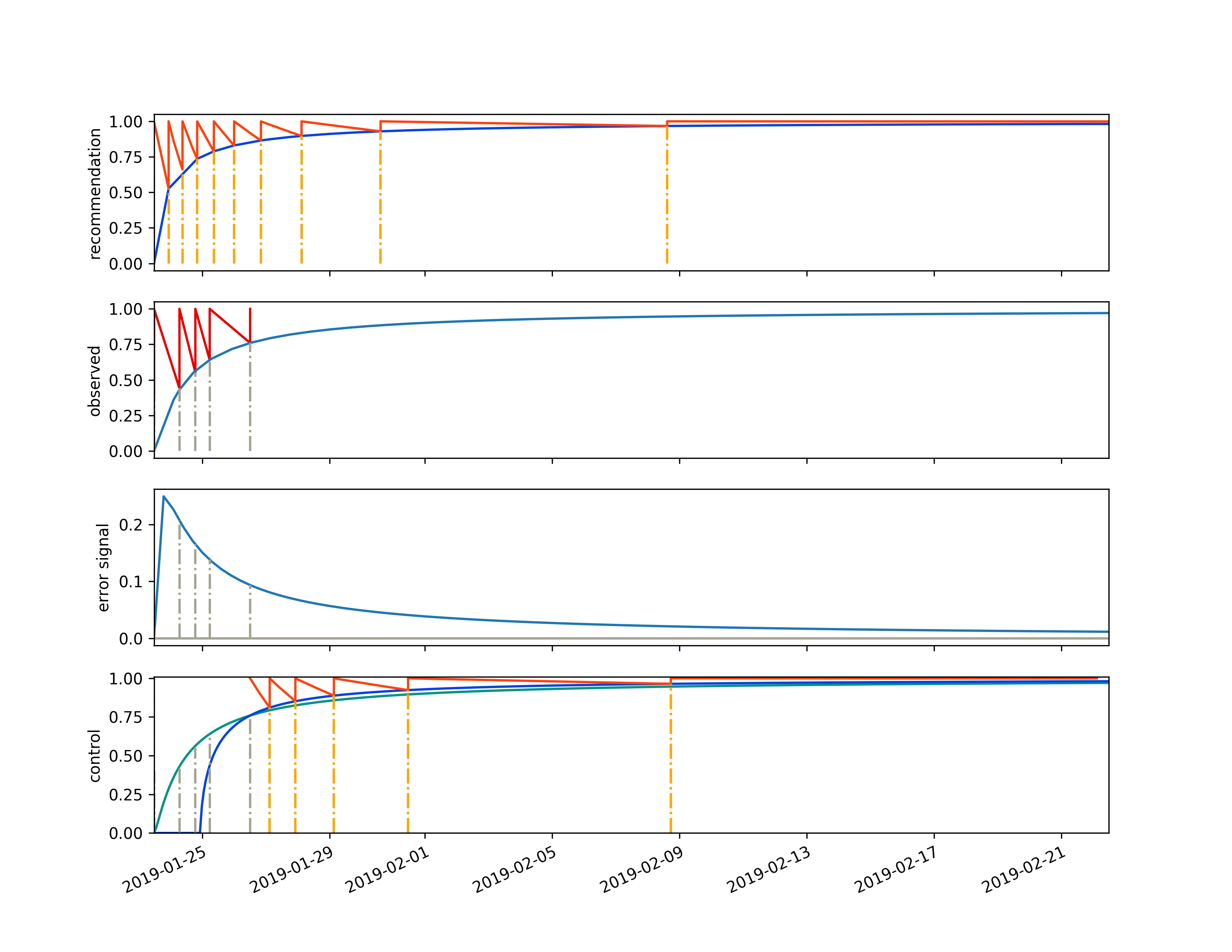
The learning tracker diagram above contains four different graphs. The first graph is called the recommendation. It represents the goal of our training engagement with this student for the thing that they are trying to learn. It is exactly the same as the reference graph we plotted above.
The 2nd graph represents the observed data that the student has given us. At time zero they could remember 40 percent of an idea after their initial training session. They retrained, then retested themselves 0.8 days later and got 44 percent. Then they retrained again. The light blue line on the observed curve is an analogue to the dark blue line on the recommendation curve. It is a plasticity curve, but unlike the reference-plasticity curve in the recommendation graph, the observed-plasticity curve is discovered by fitting a line to the data provided as feedback from the student. It is describing how a long term memory is actually forming in the student’s mind, not how we wish it would be formed (represented by the dark blue line in the recommendation graph).
The 3rd graph down the page, labeled “error signal” is the difference between what we want and what we got. Specifically it is the difference between the recommendation graphs plasticity curve and the observed plasticity curve (the dark blue line in the first graph minus the light blue graph in the second graph). The y-axis of this plot can be positive, if a memory isn’t forming as fast as we want, or negative, if the student is studying too much or doesn’t really forget things; causing a memory to form faster than our recommendation.
The final graph, the 4th graph, is labeled “control”. This is because it
describes how the spaced algorithm tries to drive its error signal to zero
by controlling the world in the only way it can: by shifting its schedule
recommendations. It does this in two ways, it tunes the forgetting curves (the
red stickleback lines) to match how a student actually forgets things and it
finds the intersection between the observed plasticity curve and the
reference-plasticity curve, then redraws the updated-forgetting-stickleback on
the reference-plasticity curve at this intersection point.
Lets see what happens if the student continues to train.
# students tests themselves 1.75 days after they start training
# they recall about 64 percent of the thing they are studying
days_since_training_epoch = 1.75
lt.learned(result=0.64, when=days_since_training_epoch)

# the student reviews their material until
# they have a perfect recollection

# students tests themselves 3.02 days after they start training
# they recall about 76 percent of the thing they are studying
days_since_training_epoch = 3.02
lt.learned(result=0.76, when=days_since_training_epoch)
# the student reviews their material until
# they have a perfect recollection
Now suppose the student trains six more times:
days_and_results = [
  [4.8,  7.33, 10.93, 16.00, 23.00],
  [0.83, 0.89,  1.00,  0.99, 0.99],
]

for d, r in zip(*days_and_results):
  lt.learned(result=r, when=d)
Now let’s ask the learning tracker for its schedule up to the 30th days after the training began:
print("Schedule as dates up until 30 days after the training began:")
print(lt.schedule(stop=30))
The above code will output:
Schedule as dates up until 30 days after the training began:
[]
The schedule result is empty. Is this right? To find why it is empty, let’s look at this learning tracker’s graph:
hdl, _ = lt.plot_graphs(stop=30)
lt.show()
hdl.close()  # save your computer's memory

By looking at the above graph we can see why the schedule results are empty when we give it a stop date of 30 days after epoch. Our last training moment was at a 23 day offset, and our next training day has been spaced out into the future beyond the right hand side of the graph.
To get the next training dates we can just ask for it like this:
print("Next scheduled training date:")
print(lt.next())
print("Next scheduled training date as an offset:")
print(lt.next_offset())

print("\nAsking a second time")
print("Next scheduled training date (same as before):")
print(lt.next())
print("Next scheduled training date as an offset (same as before):")
print(lt.next_offset())
This will output:
Next scheduled training date:
2019-05-21 15:09:07.385615
Next scheduled training date as an offset:
118.37

Asking a second time
Next scheduled training date (same as before):
2019-05-21 15:09:07.385615
Next scheduled training date as an offset (same as before):
118.37
The next API will always return information about when the next training
date should occur. You can call it multiple times and its answer won’t change,
unless you provide the learning tracker with more learned feedback.
The last graph answered the problem about our missing schedule, but other than that, it wasn’t that useful: the next recommended training date wasn’t on its control plot.
It’s hard to get a clear idea about what is going on by looking at any of these plots in isolation. What is better is to flip through them one at a time in sequential succession; in this way, you can look at a plot while having its history in your recent visual memory to provide context about how things are changing. What we want is an oscilloscope; a device that animates plots in real-time.
The spaced library provides this animation feature, and it is described in
the next section.
Animating the Reactive Schedule to get an Intuitive Feeling about Results
The spaced package can write mp4 encoded videos using the ffmpeg
animation plugin provided by matplotlib.
To make a video, using the animate api:
lt.animate(
  student="Name of Student",
  name_of_mp4="results/report_card.mp4",
  time_per_event_in_seconds=2.2)
If you were to write this code, the results of this session would be used to
make a video in results/report_card.mp4. That video would look something like this:
As you play the video, you see a story unfold about the relationship between our model and the student’s reaction to it. In the first five days of their training, we see that they made more mistakes than we would have liked, then, around the seventh day, something clicks for them, and they do better than what was predicted by the original model.
We can see that the control system tried to get them to do much more training when they were doing poorly, and less training when they started to understand the material. When the dark blue reference curve in the control box moved to the left, the student was doing better than expected, and when it shifted to the right, the student was doing worse than expected.
We also see that our initial forgetting curves were too pessimistic, and as a result, our initial schedule was too aggressive. But after a few training events, the spaced algorithm began to match the forgetting parameters to how the student forgot things.
The video plays a training event every second, which means that we are accelerating time since the training events become more and more spaced out the later they occur.
Predicting Future Results
It is unlikely that you will be using spaced to track just one object. You
will probably have thousands of them running, and you will have to select from a
small subset of these thousands of tracked objects to compile a review session
for your student. To do this, you need to know which of your tracked spaced
objects are in the most need of attention.
For this reason, you will need to query a spaced object so that it can
predict a student’s ability to recall a fact at some datetime. To predict a
result, you can use the learning tracker’s predict_result API.
To demonstrate this, I will make a set of predictions and graph them onto the plot generated by the learning tracker.
Here is how to do this:
from datetime import datetime
from repetition import pp
from repetition import LearningTracker

# create a learning tracker
lt = LearningTracker(
    epoch=datetime.now(),
)

# give our learning tracker some feedback
for d, r in zip(
    [0,    0.8,  1.75, 3.02, 4.8,  7.33],
    [0.40, 0.44, 0.64, 0.76, 0.83, 0.89],
  ):
  # r: result
  # d: days since training epoch
  lt.learned(result=r, when=d)

# get a set of datetimes
useful_range_of_datetimes = \
  lt.range_for(curve=1, range=10, day_step_size=0.5)

# make a results query using these datetimes
results = [lt.predict_result(moment, curve=1) for
            moment in useful_range_of_datetimes]
hdl, _ = lt.plot_graphs()

# get the handle for the last subplot so we can draw on it
control_plot = hdl.axarr[-1]
control_plot.plot(
  useful_range_of_datetimes, results, color='xkcd:azure')

lt.show()
hdl.close()  # save your computer's memory
Here is the resulting plot:

You can see when we plot a set of queries for the results of the first learning curve over a set of datetimes, that the line representing this information extends downward past the plasticity line. This is because the query assumes that no additional training event will occur.
But this graphing code is kind of awkward: we create a plot, get the matplotlib graph handle, then plot some more data into the same graph and then close it down. That is a lot for you to remember. If you forget to close the plot handle, you use a lot of memory. If you do this too many times you will have a memory leak, something that could show up far in the future and evade simple reproduction steps when you are trying to trouble shoot your system.
Python has an answer for these kinds of build-up-and-tear-down problems, it is
called a context manager. The spaced library uses a context manager to give
you a cleaner API for graphing. You can see how it works in the following
example:
from datetime import datetime
from repetition import LearningTracker

# create a learning tracker
# and give it some student feedback
lt = LearningTracker(epoch=datetime.now())

for d, r in zip(
  [0,    0.8,  1.75, 3.02, 4.8,  7.33],
  [0.40, 0.44, 0.64, 0.76, 0.83, 0.89]):

  lt.learned(result=r, when=d)

# plot some control predictions on the first forgetting curve
# of the control graph
with lt.graphs(
  stop=43,
  show=True,
  control_handle=True,
  filename="context_manager_one_handle.svg") as ch:

  moments = lt.range_for(curve=1, stop=43, day_step_size=0.5)
  predictions = [
    lt.predict_result(moment, curve=1) for moment in moments
  ]
  ch.plot(moments, predictions, color='xkcd:azure')
This code will provide a graph handle to the controller subplot in the learning tracker graph, let you plot against it and then close everything after you have finished with it. The resulting file would look like this:

You can use the same context manager to make predictions on the reference and the control graph, by specifying you want graph handles for both subplots. Here is some example code that show how to plot a prediction on the reference and the control graphs:
from datetime import datetime
from repetition import LearningTracker

# create a learning tracker
# and give it some student feedback
lt = LearningTracker(epoch=datetime.now())

for d, r in zip(
  [0,    0.8,  1.75, 3.02, 4.8,  7.33],
  [0.40, 0.44, 0.64, 0.76, 0.83, 0.89]):

  lt.learned(result=r, when=d)

# plot some reference predictions on the 3rd reference forgetting
# curve and the 1st control forgetting curve using the
# spaced context manager
with lt.graphs(
stop=43,
control_handle=True,
show=True,
reference_handle=True,
filename='context_manager_two_handles.svg') as (rh, ch):

# plot some reference predictions
r_m = lt.reference.range_for(curve=3, stop=43, day_step_size=0.5)
r_p = [lt.reference.predict_result(moment, curve=3) for moment in r_m]
rh.plot(r_m, r_p, color='xkcd:ruby')

# plot some control predictions
c_m = lt.range_for(curve=1, stop=43, day_step_size=0.5)
c_p = [lt.predict_result(moment, curve=1) for moment in c_m]
ch.plot(c_m, c_p, color='xkcd:azure')
This code would product a graph that looks like this:

Building a Better Initial Student Model
As the spaced algorithm reacts to student feedback, it gets a much better
idea about how the student remembers and forgets in their current environment.
It’s control system tunes the forgetting and plasticity parameters as it tries
to build a better schedule.
Now imagine we let one learning tracker run for a while, then we pulled its discovered parameters to create some initial conditions for another learning tracker, one with a more realistic set of goals. These goals would be based on how a student has behaved in the past, instead of some imagined thing.
I’ll demonstrate how to do this, by first simulating a full training session (10
lessons) using the arbitrary default values of the spaced algorithm.
from datetime import datetime
from repetition import LearningTracker

day_offset_from_epoch_and_results = [
    [0,    0.81, 1.75, 3.02, 4.8,  8.33, 10.93, 16.00, 23.00, 29.00],
    [0.40, 0.44, 0.64, 0.84, 0.83, 0.89,  1.00,  0.99, 0.99,   1.00],
]

# create a learning tracker with arbitrary default parameters
lt_arbitrary = LearningTracker(
  epoch=datetime.now(),
)

# plot the third lesson so we can take a look at the differences
# between some made up model and a model based
# on some previous feedback
lesson_to_graph = 3

# mimic a full training session
for index, (d, r) in \
  enumerate(zip(*day_offset_from_epoch_and_results)):
  # r: result
  # d: days since training epoch
  lt_arbitrary.learned(result=r, when=d)

  # plot the lesson we want to graph
  if index is lesson_to_graph - 1:
    hdl, _ = lt_arbitrary.plot_graphs(stop=43)

 lt_arbitrary.show()
 hdl.close()

So what can we learn from this?
1. Our student forgets things slower than we expected: The forgetting curves in the recommendation plot are steeper than that seen in the feedback plot.
2. Our student is remembering the things slower than we wanted them to learn: The error signal is positive.
Now lets build another learning tracker using the discovered parameters from letting the first learning tracker run for ten lessons:
# get better initial model parameters based on previous
# experience with the student

# to get the discovered parameter from a previous training session,
# pre-pend 'discovered' in front of the parameter name,
# and call this word like a function
bpr = lt_arbitrary.discovered_plasticity_root()
bpdo = lt_arbitrary.discovered_plasticity_denominator_offset()
bf0 = lt_arbitrary.discovered_fdecay0()
bft = lt_arbitrary.discovered_fdecaytau()

lt_better_fit = LearningTracker(
  epoch=datetime.now(),
  plasticity_root=bpr,
  plasticity_denominator_offset=bpdo,
  fdecay0=bf0,
  fdecaytau=bft
)

# plot the third lesson so we can take a look at the differences
# between some made up model and a model based
# on some previous feedback
lesson_to_graph = 3

for index, (d, r) in \
  enumerate(zip(*day_offset_from_epoch_and_results)):
  # r: result
  # d: days since training epoch
  lt_better_fit.learned(result=r, when=d)

  # plot the lesson we want to graph
  if index is lesson_to_graph - 1:
    hdl, _ = lt_better_fit.plot_graphs(stop=43)

  lt_better_fit.show()
  hdl.close()

Note
Try and pretend this plot is from real student feedback and not from a conjured example.
We trust our recommendation curve more than we did when it was completely arbitrary, so now what can we learn from this diagram?
Our eyes glance at how the forgetting curves on the recommendation graph and the observed plot are falling at around the same rate. This means that our model seems realistic, letting us make some clearer inferences about the results of the control plot.
The difference between what we want and what we got can be attributed to how the student isn’t meticulously following the recommended schedule. This is the expected behavior, since the schedule could place training in the middle of the night or at some other inconvenient time for the student. It doesn’t matter if the student religiously follows their schedule, since the schedule is adaptive. What we want to see is if they are kind of following that schedule and if the observed plasticity curve kind of looks like our reference plasticity curve; it does.
Summary: our student seems to be on track.
Dealing with Forgetting Over the Long Term
What happens to a schedule after an idea has been mastered? To answer this we must first ask a different question, what happens to a memory after it has been mastered over the first couple of months?
Your memories are reliant on physical three dimensional chemical-electrical circuits in your brain tissue. These circuits are built up as a pattern of neuron and glial cells. The neurons connect in such a way that their pattern will offer up the memory when it is stimulated by an electrical impulse – this impulse being a kind of query from another part of your mind. The electrical wave front propagating out from your memory’s neural cluster offers-up what feels like knowledge, and recollection in your conscious awareness.
The transmission of these memory wave fronts through the brain make memories holonomic: A memory exists in all parts of the brain all at once. This is because a network can have multiple patterns imprinted on them at the same time, and a pattern is imprinted when a network experiences a wave front.
Think about how sand organizes itself on a beach in reaction to a wave. It, and its adjacent particles flow with the wave front, only to re-settle into a stable state once the watery part of the wave subsides back into the ocean. Every wave will move the sand, but the sand mostly stays in the same location over time.
We have large craniums, but they are not infinite, the real-estate in the brain is limited, and if a specific network pattern is not being used it could be pruned back; its volume, resources and cells commandeered to map another memory. Your brain organizes its neurons using adversarial competition, so if a memory network doesn’t have a signature that expresses utility, it could very well be cannibalized to map another set of ideas. At least it looks this way from the outside. Maybe all that is happening is that the sand on that part of the beach has been re-organized by many many different thoughts, many different wave-fronts impressing their patterns onto that patch of sand.
This process is largely passive, mysterious and outside of our conscious control. The brain’s pruning and plasticity mechanism can’t determine what you think of as being consciously important; they use an emergent recipe brought to us by evolution, it optimizes for your survival; it is based on emotional queues, when the network was fired last, where a network is situated in the brain, not to mention many other factors.
To save a trained skill, and its neural pattern from oblivion, we need to activate it from time to time. This will not guarantee that you won’t lose your hard-fought memory, but it will reduce the probability of its destruction.
So, this is just a really complicated way of saying that we have to think about the thing we understand to hold off the brain’s garbage collector.
We have to activate a network even after it has been mastered. This can happen very infrequently, and it can be thought of as a kind of maintenance pulse.
To see how this works with the spaced library consider the following
example:
start_time = datetime.now()

# track for 2 years
days_since_epoch = 365*2

lt = LearningTracker(
  epoch=start_time,
  long_term_clamp=0.00005,  # default
)

# the idea is mastered over two months
day_offset_from_epoch_and_results = [
  [0,    0.81, 1.75, 3.02, 4.8,  8.33, 16.00, 23.00, 29.00, 60],
  [0.40, 0.44, 0.64, 0.84, 0.83, 0.89,  0.99, 0.99,   0.90, 0.99],
]

for d, r in zip(*day_offset_from_epoch_and_results):
  # r: result
  # d: days since training epoch
  lt.learned(result=r, when=d)

# look at the schedule over two years
hdl, _ = lt.plot_graphs(stop=days_since_epoch)
We create feedback for 60 days and look at the schedule recommendations provided
by spaced for two years:

You can see the maintenance pulses are just schedule suggestions over the longer term. The schedule is sparse immediately after mastery then it tightens up more and more into the future.
Doesn’t this mean that as time progresses, spaced will annoy the student with maintenance reviews?
There will be a lot of spaced learning trackers for each student in a system. As a student adds more items to their education, in aggregate, their learning tracker’s schedule suggestions will cause a kind of attention-jam. The student can only look at so much per review without being exhausted. So the system will have to ignore some schedule suggestions, or the system will stop working as it scales.
The client code using spaced will query each of the objects and select a subset of them which are in most need of maintenance, then it will use these items for the review. Well, this is almost true.
The client code will run a kind of lottery, where each of the learning trackers will get one or more lottery tickets. The number of lottery tickets given to each tracker will be proportional to how bad their student’s memory will be at the moment of the review. In this way, young, weaker memories, will get more tickets. After the tickets are assigned, the client runs a lottery. The number of draws in each lottery will be proportional to how much attention a student can put into their review. The learning trackers with the winning tickets will win the student’s attention.
Or, in more technical language, the client code will have a sampler who’s probability distribution is distorted by the query results, such that it will have a bias to select things that are about to be forgotten.
After a student has mastered an idea being tracked with a learning tracker, its forgetting curves remain mostly flat, so a query made against it in the maintenance pulse part of its schedule, will return a value very close to one. A learning tracker’s in their maintenance phase won’t be given very many lottery tickets.
So when you look at the above curve, and its schedule, you can think of these times as moments a geriatric memory is given a single lottery ticket, in a lottery that is rigged for youthful memories.
What happens if a geriatric memory wins a lottery and gets into a review? Well, it will stop trying to get tickets for a while, you can see this in on the above graph at 2019-04. The time between review suggestions swells a bit. Then a pressure will build again, and it will try to get into more and more lotteries (but the client will only give it one ticket).
prev, top, next